Ian Christie
on Tue 21 June 2016A Film For All Time: A Man For All Seasons
Posted on Tue 21 June 2016
Ian Christie shares some thoughts

Garlanded with awards, and built around one of the greatest of Paul Scofield's relatively few screen performances, you might assume that A Man for All Seasons was a considered a sure-fire winner from the outset. But in fact the financiers, Columbia Pictures, were sceptical, and kept the budget low, while pouring resources into what they believed would be a winner - the disastrous Bond spoof Casino Royale.
I'd never thought much about what seemed a rather staid and moralistic movie, until I got to know its designer, John Box, and started to appreciate it through his memories of what had been a much harder production that most audiences would imagine. Made on what amounted to a shoestring at Shepperton, by the Hollywood veteran Fred Zinnemann, with Box fresh from his experiences on Lean's Lawrence of Arabia (1962) and Dr Zhivago (1965), this tested both of them and succeeded far beyond all expectations.
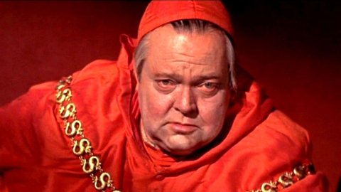
The 1960 play on which it was based had made its author Robert Bolt famous in London and on Broadway, and had already led to him becoming a star screenwriter, with Lawrence of Arabia in 1962. But its staging had always been spare and stylised, which would hardly work on screen. Since Zinnemann and Box had no wish to smother the script's battle of wills between Henry and his chancellor in lavish period décor, their lack of resources may well have proved a blessing in disguise. The spaces through which Thomas More moves as he is first wooed and then abandoned by the king are never lavish. Even when he visits Orson Welles' Cardinal Wolsey at Hampton Court, this night-time meeting uses a studio-built façade for the palace, and squeezes the imposing figure of Welles into a small room that has the effect of making him seem both sinister and powerful.
Box's own analysis said it all: “The strength of this scene is in the dialogue and the characters. Play the scene in a small room; with Wolsey sitting at his desk and not even bothering to get up. The desk will be smaller than it should be, which will make Wolsey look larger. No architectural detail except a window, because they have to look out to see Anne Boleyn come up, no furniture or dressing to impinge on the drama of the scene.” His model for the set-up was actually the bullying Lawrence producer Sam Spiegel: “I always felt that the room was getting smaller and smaller as I talked to Sam, and I was getting trapped in it.”
His boldest stroke was to have the walls the same colour as Wolsey’s red cardinal’s robes. “Fred didn’t agree for a while,” he recalled, “but finally he said yes.” And on the day of shooting, Orson Welles thought the idea so good that he arrived on set with red make-up to enhance the crimson menace of the scene.
Probably the two most memorable settings in the film are the large hall where More's trial takes place, and his cramped cell in the Tower of London. The contrast is stark, underlining Bolt's and Zinnemann's commitment to More's conscientious stand in public and in private, and both are strikingly devoid of anything that might distract from his progress towards martyrdom. For the show-trial, Box remembered his only visit to a bull-fight in Spain, and how he had hated the feeling of a crowd gathered to witness blood-letting. “There needed to be an idea for the scene, and I thought of making it like a bull-ring, with More in the middle in a flat area, the judges high up with a coat of arms behind them and spectators at the sides.”
The treatment of the Tower is even more ingenious. Instead of showing its exterior, we are inside More's dark, cramped cell. But we see the outside world going about its business through his eyes, as he looks out of the window at different seasons. Apart from showing the passage of time from the prisoner’s viewpoint, and reminding us of the family life he is cut off from, these images echo the seasonal illustrations that were common in illuminated manuscripts – which Box's mentor, Carmen Dillon, had used for Olivier’s ground-breaking Henry the Fifth back in 1944.
Understanding the reasoning and ingenuity that lay behind every scene in the film was a revelation. Who, for instance, would have guessed that the royal barges carrying Henry to visit his chancellor were conceived as the Aston Martins of their day - speedy, stylish and luxurious? I'm convinced we don’t pay enough attention to how films are actually constructed by thoughtful filmmakers; and A Man for All Seasons could serve as a textbook for anyone wanting to learn about the craft from some of its masters.
Written by Ian Christie. Ian Christie's The Art of Film: John Box and Production Design is available from Columbia University Press.
A Man For All Seasons screens Sunday July 31st at 3.20pm as a part of Cinema Rediscovered.
