How I Made My Own Zine
Callum made his own zine and wants to share it with you, as well as his process, so you can make your own.
I feel as though, as a society, we tend to get distracted easily.
My latest work entitled ‘For us, By us’, comes in the form of a digital zine, and can be found on issuu. Whenever I look at a book or piece of writing, I tend to value both its content and visual appeal. Like many people, I struggle to draw freehand and feel more comfortable working on a digital format with things like Photoshop, as it allows me to get ideas from my mind onto a page without feeling frustrated at the outcome of my drawings; creating on a digital format allows me to have the creative freedom necessary to create something that is visually appealing. I feel as though, as a society, we tend to get distracted easily. Knowing this, I made sure that the zine was as visual as possible. I knew what I wanted to say and I knew that in order to get my message across, I would have to keep the viewer interested in the contents visual, so that they would ultimately focus on what I had to say.
The poem’s content coincides with the 3rd eye concept perfectly and is a great example of why persistence is key.
I created the zine entirely on Photoshop. Photoshop was initially something I was taught to use in my Photography lessons, so it just made sense to use software that I feel comfortable with. So, after getting a general idea of what I wanted to say within ‘For us, By us’, I then had to think about how I would format my work. Ultimately, I decided to present my work on an A5 spread. Personally, A5, although seeming small, seems to be the perfect size for a zine; mainly due to it being small enough to not over whelm the reader, whilst being big enough to fit everything I have to say on it. As a visual thinker, the moments after decided what size of paper to use can be stressful, mass amounts of ideas seemingly come to no prevail. However, every so often, an idea will formulate and will seemingly spark ideas that I never thought I’d be capable of coming up with for the zine.
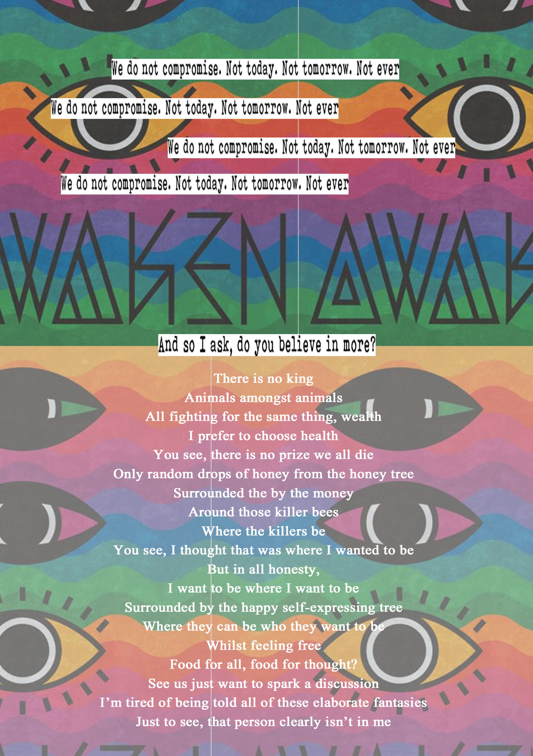
So here, for example, when writing the ‘Animals amoungst animals’ poem, the idea of including the concept of the ‘3rd eye’ only came to my mind after multiple frustrating attempts at trying to create something visual that would compliment the things I wanted to say. The poem’s content coincides with the 3rd eye concept perfectly and is a great example of why persistence is key.
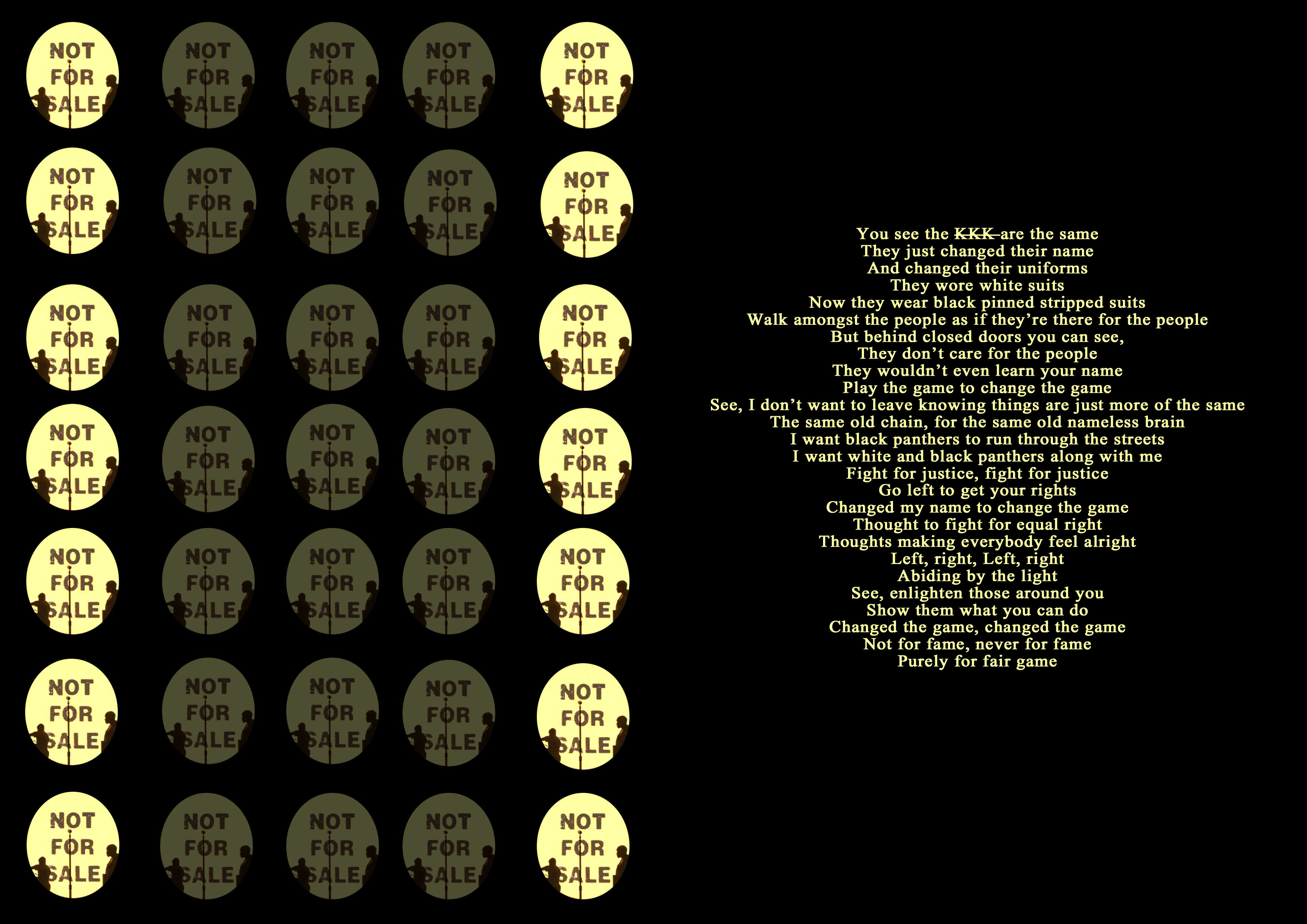
The balance between great content and an interestingly visual layout can be a real battle, especially when it comes to finding a layout that compliments the less visually interesting ideas that need to be a part of the zine, as they behold the best content. An example of this is the ‘KKK’ poem. The full version of the poem is a lot longer but I decided to compromise some of the poem’s detail in order for it to still be visually appealing. In short: I’d rather have someone read the strongest section of one of my poems, than simply not read it all because of how it looks on a page.
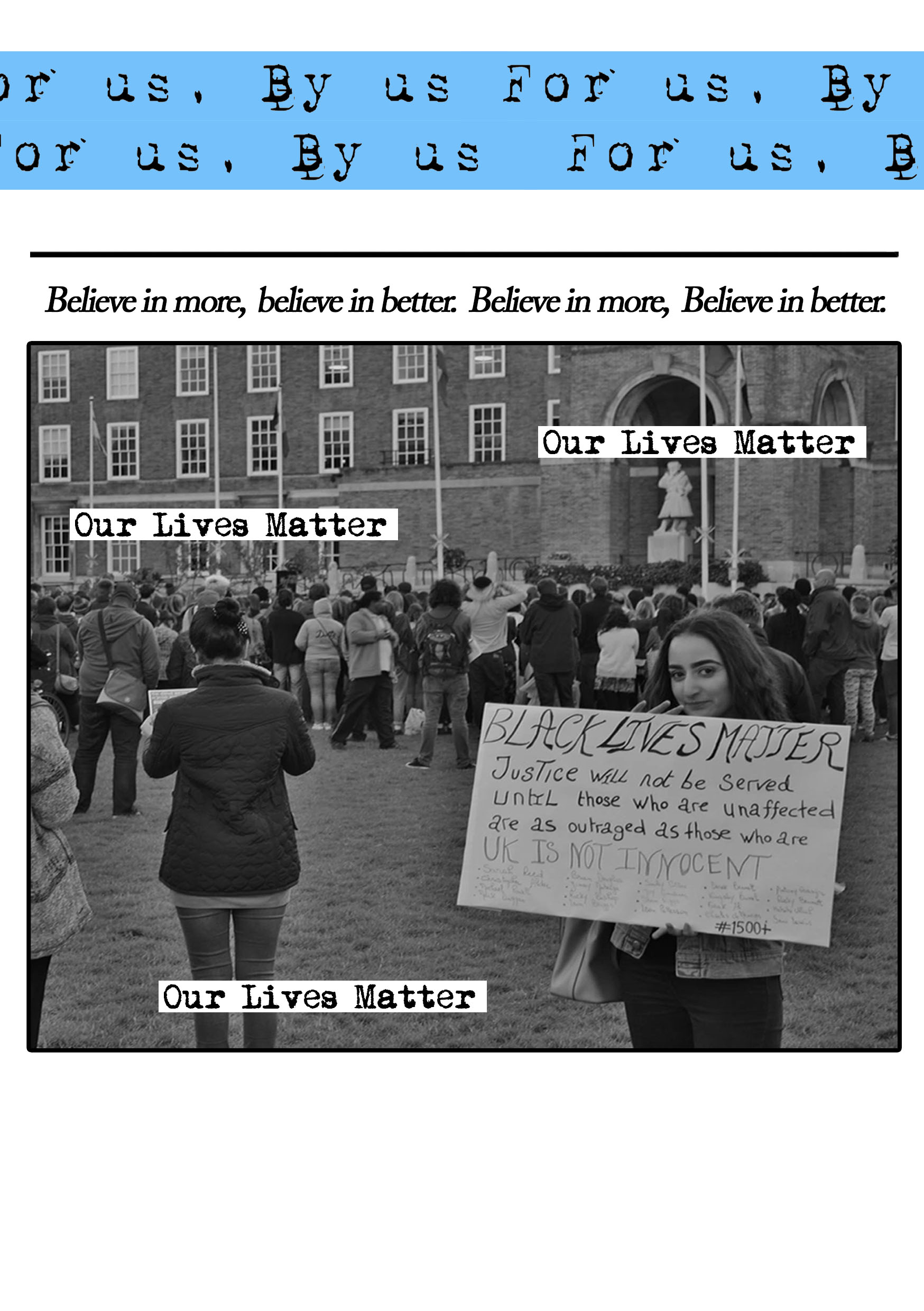
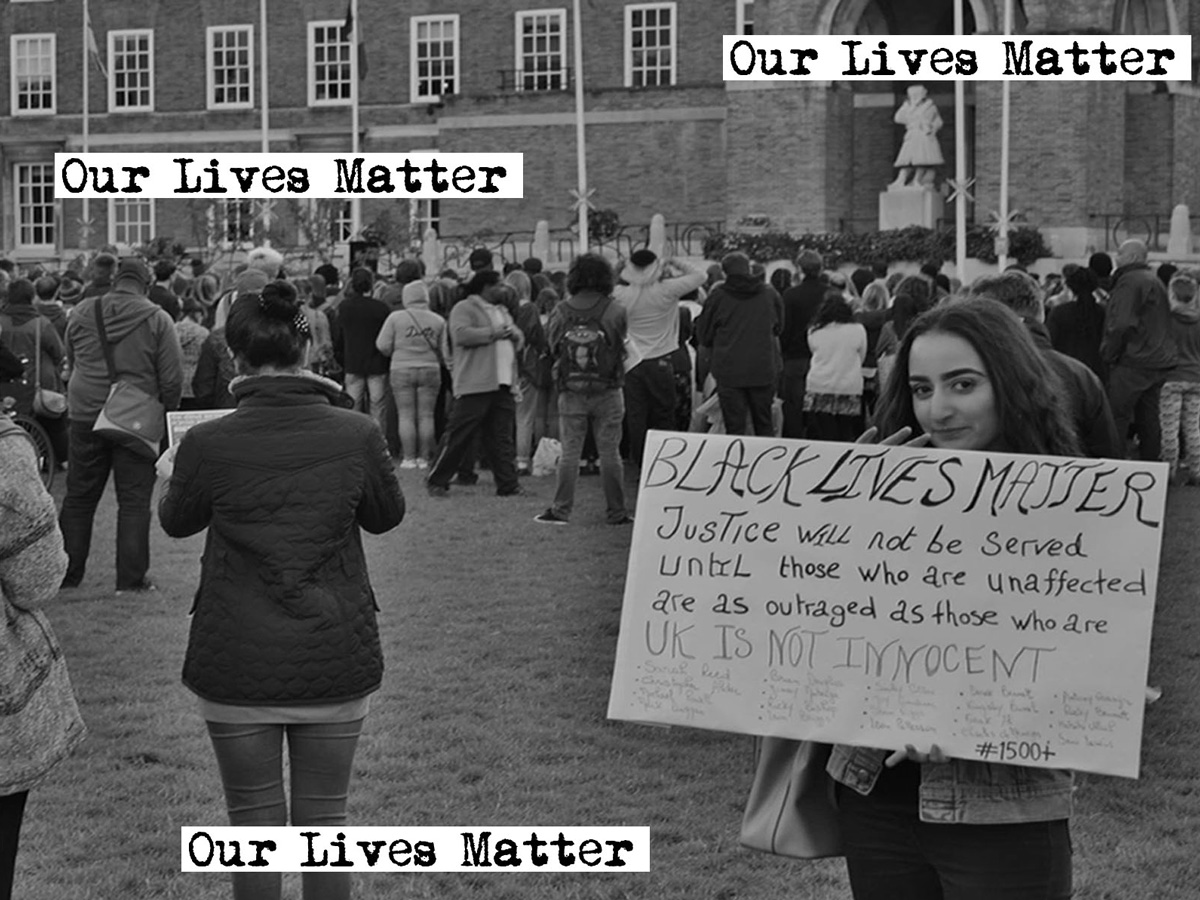
The first thing anyone will see when they look at any form of magazine is the front cover. I made sure to construct a front cover that would almost summarise and help to give the viewer an idea of what the overall tone of what the zine would be. I chose to include an image I took at a ‘Black Lives Matter’ protest on College Green, whilst overlaying the words, ‘Our Lives Matter’, in order to try and include the masses of people who experience prejudice.
The first thing anyone will see when they look at any form of magazine is the front cover.
Like the front cover, the back page can be just as important when it comes to showcasing the overall theme of the zine. Viewers, after reading everything you have to say, may be left with a clouded idea of the most important concepts raised were. By almost summarising all of your points within the back page, you are giving the viewer that one last bit of information that will probably be one of the only things they take away from the zine, due to it being the last thing that they’ve read.
The last step, after creating all of the work, is finding a place to publish it. I have been using issuu for many months now and probably always will. It allows work to have a professional finish, whilst allowing it to be easily downloaded and shared within social media sites. Accessibility is an important aspect to keep in mind when showcasing work, there is no point in creating something for the people if they cannot read it and in turn, share the work themselves.
Top Tips
- Have a concrete idea of the concept for the zine. Having a good idea of what you want to speak about will help you to create and come up with ideas.
- Create an interesting and memorable title, along with front cover, to gain your audiences interest.
- Stay patient; Patience and persistence are key to creating something you enjoy. If an idea isn’t working, don’t force it, you can’t expect every idea to turn into a great piece of content.
- Appearance is just as important as the written content. There is no point in creating something that people won’t want to read due to it not being visually appealing.
- Lastly, just enjoy whatever you end up creating. If you don’t enjoy looking at your work, how can you expect others to do so.
[rife-guide-events]

